top of page


Drawchange Re-design
Case Study

High Level - My design process
Drawchange is a nonprofit organization aiming to assist kids, using art therapy.
Our UX team was tasked to review and redesign the website for a local (Atlanta) non-profit. We chose Drawchange's website, where we completed user testing, identified and resolved usability issues.
Through User Testing, we discovered that Drawchange's Home page was information-dense, challenging to navigate and did not provide users with a clear path to complete their goals.
Our redesign focused on improving the experience for the most prevalent users: volunteers and donors. We defined and implemented a sitemap and navigation which simplified the interaction for these users.
Finally, we developed a high fidelity prototype using Figma, to redesign the Home, Volunteer and Donate pages.
User Research
In order to better understand our users and tailor our design to their needs, I talked to customers and analyzed how they used the site.
Based on these valuable user insights, we were able to define problems, brainstorm solutions, then prototype and test these potential solutions.
The most frequently used pages were "Home", "Volunteer", and "Donate", which is where we focussed our design efforts.
Video of current Drawchange website:
To better pinpoint user pains, I tested the current site with users, observing any elements they didn't understand or could not navigate through with ease.
Took User Interview Notes:

I also looked into other popular "Volunteer" and "Donate" websites, to further understand what makes them successful.
Research on competitor sites was compiled into a Competitor analysis document in Google Sheets.
Defining Challenges
Our goal was to provide users with the opportunity to volunteer or donate from wherever they are located.
This process needs to be take only a few simple steps, something that the original site didn't do.
Example of original 'Donation' form on current site
I assembled our user feedback and insights, then discussed which pain points to resolve, to help our user's achieve their tasks and goals.
Highlighted key user insights in an Affinity Diagram:

To tailor our designs to intended users, I created a User Persona, highlighting the user's pains, gains, needs and motivations that we observed during user testing and interviews.
Developed a user persona:

I collaborated with my team to create user insight and problem statements, and establish next steps to redesigning our product.
User Impact Statement created in Figma

Problem Statement created in FigJam

Ideation (Brainstorming)
As a team, we discussed the pain points to help user's achieve their tasks and goals. The output of the Ideation phase was a list of proposed design changes, which we added to our backlog.
Brainstorm the product's impact on our intended user

To get a better understanding of the user's current journey and how it lines up with their goals, we held a meeting to prioritize the impact and complexity of proposed design changes, into a value proposition map and matrix.
Organized the important and impactful changes to focus on in the first design iteration

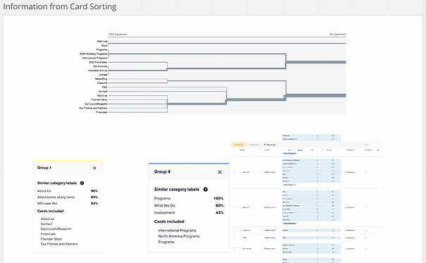
We conducted a site mapping (card sorting) session with a total of 19 users, to determine which functionalities of our main navigation that should remain, be reworded, re-grouped, or eliminated.
Collected insights from survey data, to develop an effective navigation menu
Designing
Based on our findings, we decided to focus on six areas for potential improvement, on the website.
Our six areas of improvement included:
1. improve overall navigation (mobile and desktop) from the Home page down through all sub-navigation.
2. improve explanations on the donate and volunteer pages
3. improve readability of all three pages (mobile and desktop), including color scheme and simplifying the text content
4. improve layout/style of navigation bar buttons
5. improve donation options, including adding a 'Donate in Honor of Someone' selection
6. simplify volunteer and donate forms (mobile and desktop) by making them shorter and more concise
Prioritized our main modifications in a 2x2 Matrix

Our next step was to discuss our overall site map layout. We implemented the feedback from user card sorting and determined the best organization for primary and secondary navigation.
Site Map (Navigation Redesigned)

drawchange site map
Describe your image

drawchange user flow
Describe your image
drawchange site map
Describe your image
1/2
Prototyping
Our team's goal was to create low-fidelity prototypes for both desktop and mobile devices.
Two teammates worked on the desktop prototype and I worked with another teammate on the mobile prototype.
Desktop Paper Prototype

Mobile Paper Prototype

We first developed a low fidelity design for both desktop and mobile versions.
Low Fidelity Mobile Designs

Low Fidelity Desktop Designs

In the first round of user testing I performed five usability tests, asking a series of questions to probe the effectiveness of our designs. I took note of reoccurring user pain points and areas of confusion, then presented them to my team .
The first prototype designs were in black and white, to visualize the user's experience with a basic design.
Low Fidelity Desktop Prototype in Figma

Final Design Decisions
In our final wireframes and prototype, we incorporated the redesigned moodboard (below).
One of the pain points for users of the website was the use of too many colors on the home page. It created a feeling of visual chaos.
I identified new color palettes and fonts, which incorporated 2-3 original colors from the website.
The goal was to simplify the number of colors, bringing "law and order" to the homepage.
Redesigned Moodboard


A teammate and I made a few additional modifications based on user feedback (during user testing) on our prototype design, which included...
Modification #1)
In our first prototype, the user was confused as to which of the programs their money was being donated, on the donation page.
To fix this we included additional buttons allowing the user to select the target project where their money will be sent.
Modification #2)
Usability tests revealed that users were confused by the sub-program descriptions on the Home page. Users were not sure if a specific program was supported for volunteering, for donating to it, or for signing up their children to attend the program.
To remove the confusion, I proposed the addition of "clickable cards" on the Home page, which describe a different program that Drawchange offers. The cards clearly state whether a program is for volunteers, donations, or sign-ups.
High Fidelity Desktop Prototype (Final Design) in Figma

I created high fidelity wireframes for the clickable cards, which were put through user testing.
User Journey Map for Final Mobile Redesign

Lessons I learned
I learned so many valuable lessons when working with this group of fabulous UX Designers...
Firstly, collaboration is never black and white. A person is never 'right' or 'wrong', everyone has their own ideas and opinions. However, the highest value comes from knowing the facts: what works in today's market, and what doesn't, based on user research.
Another valuable lesson I learned was to listen to everyone's perspective on a design decision. Throughout our team project, I made sure everyone had the chance to speak about a design decision, by getting their unique perspective.
And finally, I learned that when everyone puts in effort, patience and enthusiasm, the design process can be a blast! I was honored to work with such an amazing team, who gave this project their all.
bottom of page